Project: Creating Customer Segments
Getting Started
In this project, we will analyze a dataset containing data on various customers' annual spending amounts (reported in monetary units) of diverse product categories for internal structure. One goal of this project is to best describe the variation in the different types of customers that a wholesale distributor interacts with. Doing so would equip the distributor with insight into how to best structure their delivery service to meet the needs of each customer.
The dataset for this project can be found on the UCI Machine Learning Repository. For the purposes of this project, the features 'Channel' and 'Region' will be excluded in the analysis — with focus instead on the six product categories recorded for customers.
# Import libraries necessary for this project
import numpy as np
import pandas as pd
from IPython.display import display # Allows the use of display() for DataFrames

# Import supplementary visualizations code visuals.py
import visuals as vs

# Pretty display for notebooks
%matplotlib inline

# Load the wholesale customers dataset
try:
    data = pd.read_csv("customers.csv")
    data.drop(['Region', 'Channel'], axis = 1, inplace = True)
    print("Wholesale customers dataset has {} samples with {} features each.".format(*data.shape))
except:
    print("Dataset could not be loaded. Is the dataset missing?")
Data Exploration
# Display a description of the dataset
display(data.describe())
Implementation: Selecting Samples
To get a better understanding of the customers and how their data will transform through the analysis, it would be best to select a few sample data points and explore them in more detail. In the code block below, I added three indices of my choice to the indices list which will represent the customers to track.
# TODO: Select three indices of your choice you wish to sample from the dataset
indices = [47,66,124]

# Create a DataFrame of the chosen samples
samples = pd.DataFrame(data.loc[indices], columns = data.keys()).reset_index(drop = True)
print("Chosen samples of wholesale customers dataset:")
display(samples)
- What kind of establishment (customer) could each of the three samples represent?
The mean values are as follows:
- Fresh: 12000.2977
- Milk: 5796.2
- Frozen: 3071.931818
- Grocery: 3071.9
- Detergents_paper: 2881.4
- Delicatessen: 1524.8
Based on the statistical description I chose to use these samples because they are above the means in specific features. Looking at sample No. 1, you can see, that these number all are above the 75% quartile, whereas sample No. 2 rather builds a solid average for most of the features and leaves out fresh purchases (which makes it special in the sample data overall). Sample No. 3 rather specializes on fresh products and frozen products - which makes it also special in regard of the other samples.
I think these three samples all have special character in the dataset because of their statistical features.
- ${1^{st}}$ sample:
This looks like wholesale retailer buying everything in huge manner.
- ${2^{nd}}$ sample:
This looks like a classical small grocery store, where you get stuff for your household as well. No fresh food though.
- ${3^{rd}}$ sample:
This sample represents a customer that is rather focussed on buying fresh or frozen articles. This could be a cafe serving fresh food (though, you would expect a higher number for detergents paper) or a market booth selling fresh food.
Back to the question, if these numbers help a lot in finding out what kind of customer it is... I don't think you can definitely say what the customer uses the articels for, but you can have a guess by looking at a few variables. It seems like detergents paper could be an interesting variable to look at when you try to figure out if there is direct serving of customers (cafes, retaurants etc.)
Implementation: Feature Relevance
One interesting thought to consider is if one (or more) of the six product categories is actually relevant for understanding customer purchasing. That is to say, is it possible to determine whether customers purchasing some amount of one category of products will necessarily purchase some proportional amount of another category of products? We can make this determination quite easily by training a supervised regression learner on a subset of the data with one feature removed, and then score how well that model can predict the removed feature.
from sklearn.cross_validation import train_test_split
from sklearn.tree import DecisionTreeRegressor
# TODO: Make a copy of the DataFrame, using the 'drop' function to drop the given feature
dropped_column = [["Fresh"],["Frozen"],["Milk"],["Grocery"],["Detergents_Paper"],["Delicatessen"]]
for d in dropped_column:
    new_data = data.drop(d,axis=1)

    # TODO: Split the data into training and testing sets(0.25) using the given feature as the target
    # Set a random state.
    X_train, X_test, y_train, y_test = train_test_split(new_data, data[d[0]], test_size=0.25, random_state=42)

    # TODO: Create a decision tree regressor and fit it to the training set
    regressor = DecisionTreeRegressor(random_state=42)
    regressor.fit(X_train,y_train)

    # TODO: Report the score of the prediction using the testing set
    score = regressor.score(X_test,y_test)
    print("{}: {}".format(d[0],score))
Statistics
In statistics, the coefficient of determination, denoted ${R^2}$ and pronounced "R squared", is the proportion of the variance in the dependent variable that is predictable from the independent variable(s). (https://en.wikipedia.org/wiki/Coefficient_of_determination)
In our case, there are some negative values for the ${R^2}$-value. This can arise when the predictions that are being compared to the corresponding outcomes have not been derived from a model-fitting procedure using those data. (https://en.wikipedia.org/wiki/Coefficient_of_determination)
The best value you can find is for Grocery, which tells us that about 68.2 % of this figure can be predicted by the other variables all together. This means that this is the most depending variable in the dataset. This is the less useful variable we can take for determining a specific establishment for a customer.
When looking at Delicatessen though, the model fails completely so it seems that this is the most independent variable which is not influenced of the other variables around it.
Correlation
import seaborn as sns
ax = sns.heatmap(data.corr())

- You can see that the distribution of each of the variables in the data set is looking pretty similar - almost normally distributed, each with another peak at the specific mean. There clearly are some outliers for each of the variables, especially when you compare two variables in plots like these above.
When we compare the plots with the ${R^2}$-values we computed before, I want to emphasize a few dependencies:
- For the Grocery-column, you can clearly see a relationship between milk and Detergent Paper, whereas Detergent paper has a clearer dependency than milk. Looking at the other columns in comparison with Grocery, you can't really see dependencies, and when you look at the heatmap right above, there is only low dependency (low correlation -> dark field) for the combination of Grocery <-> Fresh and Grocery <-> Frozen as well as Grocery <-> Delicatessen. But there's the highest correlation exisiting in this dataset between Grocery and Detergents paper.
- Looking at the Delicatessen-row about which we found out that it has the lowest dependency on other variables, our intuition gets confirmed, because it clearly has low correlations.
- BUT, regarding the heatmap Fresh articles have the lowest correlation to any other variable in the dataset, which is shown, when you look at the heatmap's fresh-row.
Because we already looked at each of the variable's ability of being predicted, the results you can see in the scatter plot - confirm the results out of the "prediction"-test and our suspicions about dependencies.
- In the first section, I thought that Detergents paper could be a good prediction parameter but these plots show us that Fresh products seem to have less interdepency with other variables.
Data Preprocessing
# TODO: Scale the data using the natural logarithm
log_data = np.log(data)

# TODO: Scale the sample data using the natural logarithm
log_samples = np.log(samples)

# Produce a scatter matrix for each pair of newly-transformed features
pd.scatter_matrix(log_data, alpha = 0.3, figsize = (14,8), diagonal = 'kde');

Observation
# Display the log-transformed sample data
display(log_samples)
Implementation: Outlier Detection
Detecting outliers in the data is extremely important in the data preprocessing step of any analysis. The presence of outliers can often skew results which take into consideration these data points. There are many "rules of thumb" for what constitutes an outlier in a dataset. Here, we will use Tukey's Method for identfying outliers: An outlier step is calculated as 1.5 times the interquartile range (IQR). A data point with a feature that is beyond an outlier step outside of the IQR for that feature is considered abnormal.
# For each feature find the data points with extreme high or low values
for feature in log_data.keys():

    # TODO: Calculate Q1 (25th percentile of the data) for the given feature
    Q1 = np.percentile(log_data[feature],25)

    # TODO: Calculate Q3 (75th percentile of the data) for the given feature
    Q3 = np.percentile(log_data[feature],75)

    # TODO: Use the interquartile range to calculate an outlier step (1.5 times the interquartile range)
    step = 1.5*(Q3-Q1)

    # Display the outliers
    print("Data points considered outliers for the feature '{}':".format(feature))
    display(log_data[~((log_data[feature] >= Q1 - step) & (log_data[feature] <= Q3 + step))])

# OPTIONAL: Select the indices for data points you wish to remove
outliers  = [65,86,145]

# Remove the outliers, if any were specified
good_data = log_data.drop(log_data.index[outliers]).reset_index(drop = True)
Observations
- In the whole dataset we found outliers for each feature. Some features tend to have more outliers than others.
- I don't think we should remove all of these datapoints because our dataset consists of only 440 datapoints and the more data we have, the better a machine learning algorithm can work for us to find the best suited segments. I also think that the outliers, when you look at them, all seem to be have higher/lower values for the other features as well. So these outliers mainly occur if there are customers who buy a lot more than others or buy a lot less than others.
- I still removed three data points because they all had huge numbers for all categories - they are very far away from the usual means.
- Regarding the use of k-means:
- K-Means uses the means of grouped data points to find clusters based on their means.
- I found a good example on Quora to show how outliers affect the outcomes of k-means:
- Because the mean, as a statistic, is generally sensitive to outliers. The mean of 2,2,2,3,3,3,4,4,4 is 3. If we add a single 23 to that, the mean becomes 5, which is larger than any of the other values. (https://www.quora.com/How-are-k-means-clustering-algorithms-sensitive-to-outliers)
- As said before, I still want to kep the outliers to get a better distribution for the data
- As you will see, I'm going to use a Gaussian Mixture Model to cluster the data. This is more or less better for handling outliers.
Feature Transformation
In this section you will use principal component analysis (PCA) to draw conclusions about the underlying structure of the wholesale customer data. Since using PCA on a dataset calculates the dimensions which best maximize variance, we will find which compound combinations of features best describe customers.
Implementation: PCA
Now that the data has been scaled to a more normal distribution and has had any necessary outliers removed, we can now apply PCA to the good_data to discover which dimensions about the data best maximize the variance of features involved. In addition to finding these dimensions, PCA will also report the explained variance ratio of each dimension — how much variance within the data is explained by that dimension alone. Note that a component (dimension) from PCA can be considered a new "feature" of the space, however it is a composition of the original features present in the data.
from sklearn.decomposition import PCA
# TODO: Apply PCA by fitting the good data with the same number of dimensions as features
pca = PCA(n_components = 6)
pca = pca.fit(good_data)

# TODO: Transform log_samples using the PCA fit above
pca_samples = pca.transform(log_samples)

# Generate PCA results plot
pca_results = vs.pca_results(good_data, pca)

Explained variance
${1^{st}}$ and ${2^{nd}}$ component: These two components explain over 70 % of the whole variance of the dataset.
${1^{st}}$ to ${4^{th}}$ component: These four components explain about 93 % of the whole variance of the dataset.
Each dimension is build to most likely be able to explain the variance in the dataset. PCA uses dimensional reduction by building new coordinate systems within the original data. It is there to detect the maximum variance and then transforming the data onto the built coordinates. The data with maximum variance is kept so we get the least information losses.
As you can see within the visualization above, every feature then gets weights for the "new coordinate system". We can now see which features are best represented by the components:
PC1: You can see that Detergents Paper gets a highly negative weighting rate for the dimension which means that for this dimension, the correlation for Detergents Paper is higher than for other features and a higher score on this dimension will lead to a higher NEGATIVE value for Detergents Paper. The low positive correlation for Fresh and Frozen features mean that a high score in this dimension increases the valiue for these two.
PC2: The second dimension also shows strong negative weights for some variables (Fresh, Frozen and Delicatessen) and low negative weights for the other three. The logic explained above also works for this dimension of course.
PC3: Here we have another distribution of weights showing higher correlations with Fresh and Delicatessen.
PC4: This one gives us high correlations with Fresh and Delicatessen again - in other directions though.
PC5: Here we have other variables making the game for this dimension, especially Milk and Detergents Paper.
PC6: This gives us a strong negative weight for Grocery. This one shows us that the explained variance of Grocery is very low - like we already found out in our previous analyses.
All in all, you can already identify a customer's purchasing behavior well by the first four components, of course best by the first component which already gives us almost 44 % of the variance in the dataset. PC2, PC3 and PC4 are following in descending order for the best ability to describe the data's variance.
Observation
Run the code below to see how the log-transformed sample data has changed after having a PCA transformation applied to it in six dimensions. Observe the numerical value for the first four dimensions of the sample points. Consider if this is consistent with your initial interpretation of the sample points.
# Display sample log-data after having a PCA transformation applied
display(pd.DataFrame(np.round(pca_samples, 4), columns = pca_results.index.values))
Implementation: Dimensionality Reduction
When using principal component analysis, one of the main goals is to reduce the dimensionality of the data — in effect, reducing the complexity of the problem. Dimensionality reduction comes at a cost: Fewer dimensions used implies less of the total variance in the data is being explained. Because of this, the cumulative explained variance ratio is extremely important for knowing how many dimensions are necessary for the problem. Additionally, if a signifiant amount of variance is explained by only two or three dimensions, the reduced data can be visualized afterwards.
# TODO: Apply PCA by fitting the good data with only two dimensions
pca = PCA(n_components = 2)
pca = pca.fit(good_data)

# TODO: Transform the good data using the PCA fit above
reduced_data = pca.transform(good_data)

# TODO: Transform log_samples using the PCA fit above
pca_samples = pca.transform(log_samples)

# Create a DataFrame for the reduced data
reduced_data = pd.DataFrame(reduced_data, columns = ['Dimension 1', 'Dimension 2'])
Observation
# Display sample log-data after applying PCA transformation in two dimensions
display(pd.DataFrame(np.round(pca_samples, 4), columns = ['Dimension 1', 'Dimension 2']))
Visualizing a Biplot
# Create a biplot
vs.biplot(good_data, reduced_data, pca)

Observation
- As you can see by the feature projections, most variance is captured by
Detergents Paper- as we observed in the Dimension 1 before. I would argue, that most of the best correlation (if you can define it) is captured by following the data horizontally, that's why I say that. That's why our observation thatMilkandGroceryare closely following is right, too. - If you flip the visual you can see that
FrozenandFreshcapture the correlation best - that's what we observed as well.
Clustering
K-means clustering

By Chire - Own Work, CC BY-SA 4.0, Link
At first, I got some practical help from Quora: https://www.quora.com/What-are-the-advantages-of-K-Means-clustering
Advantages
- simple, easy to implement
- easy to interpret the clustering results -> That is, because you can clearly expalin how the result is developed within your data.
- fast and efficient in terms of computational cost -> You only calculate means and distances which is computationally not expensive
Disadvantages
- you might get different results for different starting points of the clustering algorithm
- spherical assumption hard to satisfy: correlation between features break it, would put extra weights on correlated features(should take actions depending on the problems) -> This can be solved by our PCA - but not 100 %
- sensitive to outliers -> I already talked about that above
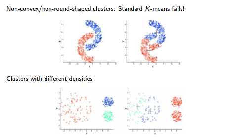
- density plays no role -> cannot find non-convex clusters or clusters with unusual shapes
Gaussian Mixture Model
from: https://www.analyticsvidhya.com/blog/2017/02/test-data-scientist-clustering/
Advantages
- this model is density-based -> as you can see in the picture above, it can identify more complicated clusters as k-means can, regarding density
- covariance structure -> In kmeans, a point belongs to one and only one cluster, whereas in GMM a point belongs to each cluster to a different degree (https://www.quora.com/What-are-the-advantages-to-using-a-Gaussian-Mixture-Model-clustering-algorithm)
- cluster shape flexibility
Disadvantages
- sensitive to initialization values -> like k-means is as well
- slow convergence rate -> non-trivial algorithms for optimization
I would choose the Gaussian Mixture Model, because it is more powerful when the data has outliers. This is because each data point gets assigned a probability for a clsuter group. As we could see in the visuals of all data points, there are some areas where we could expect Gaussian normal distributions, which we can capture more easily by applying the Gaussian Mixture Model.
Implementation: Creating Clusters
Depending on the problem, the number of clusters that you expect to be in the data may already be known. When the number of clusters is not known a priori, there is no guarantee that a given number of clusters best segments the data, since it is unclear what structure exists in the data — if any. However, we can quantify the "goodness" of a clustering by calculating each data point's silhouette coefficient. The silhouette coefficient for a data point measures how similar it is to its assigned cluster from -1 (dissimilar) to 1 (similar). Calculating the mean silhouette coefficient provides for a simple scoring method of a given clustering.
from sklearn.metrics import silhouette_score
from sklearn import datasets, mixture

def fitGMM(components):
    global clusterer, preds, centers, sample_preds
    # TODO: Apply your clustering algorithm of choice to the reduced data
    clusterer = mixture.GaussianMixture(n_components = components)

    # TODO: Predict the cluster for each data point
    preds = clusterer.fit(reduced_data).predict(reduced_data)

    # TODO: Find the cluster centers
    centers = clusterer.means_

    # TODO: Predict the cluster for each transformed sample data point
    sample_preds = clusterer.predict(pca_samples)

    # TODO: Calculate the mean silhouette coefficient for the number of clusters chosen
    score = silhouette_score(reduced_data,preds)
    return score

df_silhouettes = []
for i in range(2,12):
    result = fitGMM(i)
    print("Score for {} components: {}".format(i,fitGMM(i)))
    df_silhouettes.append({"components":i,"score":result})
df_silhouettes = pd.DataFrame(df_silhouettes)
df_silhouettes.plot(x=["components"], y=["score"])

Observation
The silhouette value is a measure of how similar an object is to its own cluster (cohesion) compared to other clusters (separation). The silhouette ranges from −1 to +1, where a high value indicates that the object is well matched to its own cluster and poorly matched to neighboring clusters. (https://en.wikipedia.org/wiki/Silhouette_(clustering)) As you can see - regarding the silhouette score - we can tell, that the optimum lies at a number of 2 components.
Cluster Visualization
fitGMM(2)
# Display the results of the clustering from implementation
vs.cluster_results(reduced_data, preds, centers, pca_samples)

Implementation: Data Recovery
Each cluster present in the visualization above has a central point. These centers (or means) are not specifically data points from the data, but rather the averages of all the data points predicted in the respective clusters. For the problem of creating customer segments, a cluster's center point corresponds to the average customer of that segment. Since the data is currently reduced in dimension and scaled by a logarithm, we can recover the representative customer spending from these data points by applying the inverse transformations.
# TODO: Inverse transform the centers
log_centers = pca.inverse_transform(centers)

# TODO: Exponentiate the centers
true_centers = np.exp(log_centers)

# Display the true centers
segments = ['Segment {}'.format(i) for i in range(0,len(centers))]
true_centers = pd.DataFrame(np.round(true_centers), columns = data.keys())
true_centers.index = segments
display(true_centers)
Results
In the beginning, I talked about Detergents Paper as interesting feature to take a look at when trying to determine if a customer has a service for people. I determined this by the figures of Detergents Paper being clearly above the mean or not - and the segment 1 shows that there is a group tending to have way larger amounts for Detergents Paper purchases (restaurants or cafes).
Segment 0 seems to deal with a lot of fresh and frozen purchases - probably markets, deli stores or grocery stores. Taking the statistical representation of the data in the analysis into account, you can now see a clear split under or above the mean of a specific feature - there's only one feature bnot being able to separate clearly: Delicatessen. In our "prediction-test" above, we already found out that this seems to be a critical variable, which is not separable quite well.
Overall, the mean of the segments for each category vary a lot - which should decrease the variance for each feature in the dataset. That way we can make assumptions for the underlying segments (especially what they are dealing with)
Comparing to reality
# Display the predictions
for i, pred in enumerate(sample_preds):
    print("Sample point", i, "predicted to be in Cluster", pred)
As I said before, these samples a vastly different in their buying behavior. My guesses before were the following:
0) wholesale retailer
- generalize it to a more general expression like "store"?
1) small grocery store
- generalize it to a more general expression like "store"?
2) restaurant or market booth selling fresh food
- still a good guess
This shows that there has to be a difference in the business - especially when talking about fresh products and detergent paper. That was already discussed when picking the samples.
After the clustering - we are able to generalize a bit more. So the idea of putting together stores and retailers and separate them from restaurant-like businesses might be a good one.
Conclusion
A/B Testing
Companies will often run A/B tests when making small changes to their products or services to determine whether making that change will affect its customers positively or negatively. The wholesale distributor is considering changing its delivery service from currently 5 days a week to 3 days a week. However, the distributor will only make this change in delivery service for customers that react positively.
A/B testing is a way to compare two versions of a single variable, typically by testing a subject's response to variant A against variant B, and determining which of the two variants is more effective. (Definition by Wikipedia: https://en.wikipedia.org/wiki/A/B_testing) When performing A/B-Tests you have a group of customers getting changes (B), and another group (A) with the purpose of testing the hypothesis that changes do not have a positive effect on customers' purchasing behavior.
In this concrete example you can define a customer segment you want to bring changes to and then look at the purchasing figures to validate the test. When looking at the delivery service, you can split each customer segment into a control group (the customers still getting the 5-day-service) and a treatment group (customers getting the 3-day-service). After a bit of time, you might see changes in purchasing figures and you'll make a statistical test with a predefined confidence level you want to reach to determine if the hypothesis (that these changes make the figures stay the same or get even worse) is false (this is the wanted outcome).
 Source: https://www.monsterinsights.com/wp-content/uploads/2018/01/ab-test-ideas.jpg
Supervised Learning
Additional structure is derived from originally unlabeled data when using clustering techniques. Since each customer has a customer segment it best identifies with (depending on the clustering algorithm applied), we can consider 'customer segment' as an engineered feature for the data. Assume the wholesale distributor recently acquired ten new customers and each provided estimates for anticipated annual spending of each product category. Knowing these estimates, the wholesale distributor wants to classify each new customer to a customer segment to determine the most appropriate delivery service.
Answer:
We can apply a trick to use all the engineered labels we got from our segmentation to train a supervised classifier (e.g. DecisionTreeClassifier or Support Vector Machine) to predict all upcoming data we get in the future.
In this case, we would take the input variables (the anticipated annual spending of each product category) and train them onto the labels (the engineered features) so that we get a model to be able to make predictions.

Source: https://cdn-images-1.medium.com/max/1000/1*xGsYc6aXehD7lyoLEn-mMA.png
Visualizing Underlying Distributions
At the beginning of this project, it was discussed that the 'Channel' and 'Region' features would be excluded from the dataset so that the customer product categories were emphasized in the analysis. By reintroducing the 'Channel' feature to the dataset, an interesting structure emerges when considering the same PCA dimensionality reduction applied earlier to the original dataset.
Run the code block below to see how each data point is labeled either 'HoReCa' (Hotel/Restaurant/Cafe) or 'Retail' the reduced space. In addition, we will find the sample points are circled in the plot, which will identify their labeling.
# Display the clustering results based on 'Channel' data
vs.channel_results(reduced_data, outliers, pca_samples)

Goodness of our Clustering
- When you take into account the
channeldata, you are able to confirm the findings I made above. This seems to be a label which we wanted to predict with our clustering. - As you can see, there are some overlapping data points in between Dimension 1 and 2, the clustering algorithm didn't capture. The data point 1 I chose for the sample was an outlier which the algorithm clustered incorrectly. But the overall performance is acceptable.
- There are probably some tweaks you can make for making the result better, but these kinds of features we have, are not enough to make an (almost) perfect prediction.
- If you used an overfitted model for supervised learning, you can always achieve 100% accuracy for the training data. But in unsupervised learning it's hard to clearly separate data, especially when you don't have A LOT of features.